In an era where everything seems driven by data, companies must undertake meticulous estimates before making informed decisions. This involves forecasting sales, predicting project timelines, and managing resources. The capacity to analyze complex data is fundamental in this context. However, raw data can be confusing and nearly impossible to comprehend. This is where data visualization becomes essential. Business Intelligence (BI) tools that transform data into visual formats are crucial for simplifying the interpretation of estimation data, revealing patterns, and thereby facilitating better decisions. This blog will explore how reality becomes more visible through report visuals, the symbolism of graphic representations, and the various issues addressed.
The Psychology of Data Visualization
People are visual beings by nature. We process images 60,000 times faster than text, and studies reveal that almost 90% of the information sent to the brain is visual. Data visualization leverages our innate capacity to swiftly identify patterns, trends, and outliers, which is why it is so potent.
Decision-makers frequently work with huge datasets, such as projections, probabilistic models, and historical data, when completing estimating projects. This data can be difficult to understand without visualization, which could result in misinterpretation or analytical paralysis. By presenting complex information in a way that is compatible with the way our brains function, visualizations make it easier to understand. For instance, a spreadsheet full of figures is much more difficult to interpret than a line chart displaying a sales prediction. Stakeholders can make decisions more quickly and confidently because of this clarity.
Typical Estimate Visualization Types
In estimating projects, several visualization types have distinct functions. The following are a few of the most widely used ones:
1. Forecasts and Trend Lines
Purpose: The goal is to forecast future events using historical data.
Example: It visually compares budgeted amounts against actual sales performance for each product sub-category, allowing for quick identification of variances and trends.

Why It Works: The reason it works stakeholders can use trend lines to spot trends and formulate data-driven forecasts.
2. Heat Maps
Purpose: The goal is to draw attention to sections of a dataset that are intense or focused.
Example: It allows for quick visual identification of high and low sales periods across different districts, with colour intensity representing the unit volume. This helps pinpoint strong and weak performing areas and months.

Why It Works: Heat maps offer a simple method for identifying anomalies or problem regions.
3. Bar and Column Charts
Purpose: Comparing values across categories or time periods is the goal.
Example: It visually compares the total sales figures for each year (2016-2019), allowing for a quick understanding of sales trends and growth over time. The longer the bar, the higher the sales in that year.
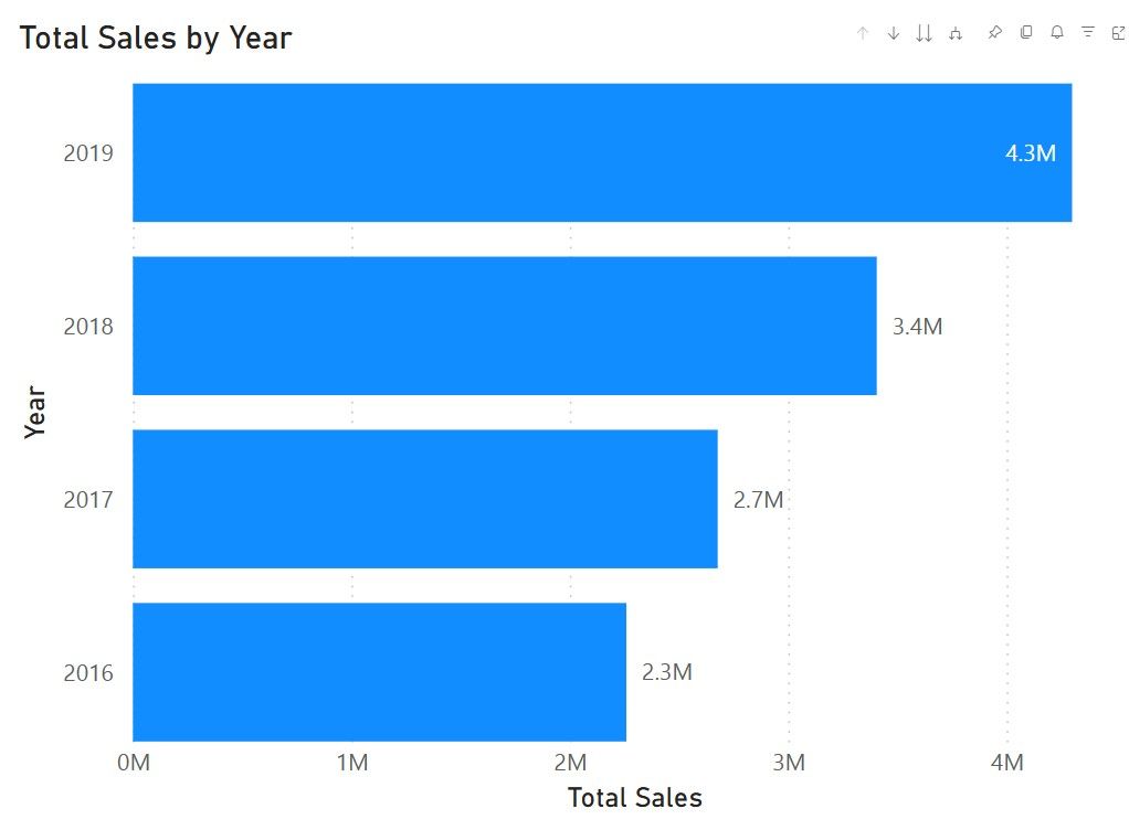
Why It Works: Discrete data points can be effectively compared using these straightforward charts.
4. Gantt Charts
Purpose: The goal is to display task interdependence and project timeframes.
Example: visually represents the schedule of different tasks (Planning, Formulation, Project Design, etc.) with their start and end dates, durations, and assigned teams/individuals (Project Manager, Lead Engineer, Software Developers). This allows for easy tracking of project progress and identifying potential overlaps or delays.

Why It Works: Gantt charts help teams remain on course by giving them a clear picture of project schedules.
5. Scatter Plots
Purpose: Finding correlations or links between variables is the goal.
Example: It helps visualize how sales performance (variance) relates to sales efficiency (per square foot) across different districts, highlighting outliers and potential areas for improvement. For example, you can quickly see which districts have high sales per square foot but are underperforming in terms of total sales variance.

6. Dashboards
Purpose: The goal of dashboards is to combine several visuals into one interactive interface.
Example: An illustration would be a BI dashboard that shows important indicators

Why It Works: The reason It works dashboards give stakeholders a comprehensive picture of the data, allowing them to track developments and make changes instantly.
Case Studies of Improved Decisions Through BI Dashboards
Case Study 1: Retail Sales Forecasting
A BI dashboard was utilized by a retail company to provide sales projections for each of its locations. The business determined underperforming areas and modified its inventory allocation by utilizing trend lines and heat maps. Sales increased by 15% as a result, and excess stock was significantly reduced.

Case Study 2: Marketing Campaign Optimization
A marketing team tracked campaign data like CTR and ROAS using a BI dashboard that included pie charts, KPI cards, and Line charts. Effective resource reallocation and the identification of underperforming channels were made possible by the visualization of performance data. As a result, the ROI increased by 25% and the waste of ad spend decreased by 15%, guaranteeing that the campaign achieved its objectives effectively.
Case Study 3: Financial Risk Assessment
A financial services organization visualized the risk elements in its investment portfolio using bar charts, KPI cards, and Combined charts. It was simpler to identify high-risk investments because of the visualizations.

Conclusion
When it comes to estimation initiatives, data visualization is revolutionary. BI technologies facilitate the rapid and accurate interpretation of complicated data by utilizing the power of visual storytelling. Visualizations, such as trend lines, heat maps, and interactive dashboards, give decision-makers the clarity they need. Organizations that adopt data visualization can see notable gains in productivity, precision, and overall performance, as the case studies show. The secret to realizing the full potential of data in a world where it reigns supreme is visualization.
You may turn raw data into usable insights by including data visualization in your estimate processes. This will guarantee that your judgments are both visually informed and data-driven.
Author: Eric Xavier is a Senior Business Intelligence engineer at CMS with experience in Microsoft Power BI, Tableau, Domo and several other BI platforms.